| View previous topic :: View next topic |
| Author |
Message |
curriguy
Enthusiastic Fan
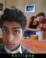
Joined: 14 Sep 2006
Posts: 397
|
 Posted: Fri Nov 17, 2006 1:22 am Post subject: I took your advice! but just ONE last question Posted: Fri Nov 17, 2006 1:22 am Post subject: I took your advice! but just ONE last question |
 |
|
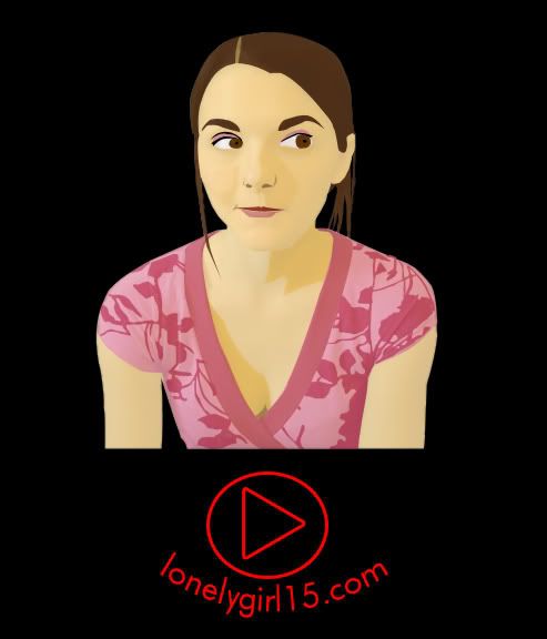
okay so I listened to all of your feedback and redesigned my TShirt.
Like you guys said, I redrew her in a more "Bree-like" pose...
I know someone wanted me to draw her with her hat...but I'd already started my drawing when I saw that...and now I'm way too tired to ever draw bree again. sorry! (maybe i'll do it a week from now..that hat is damn cute)
someone also suggested that I put the Play-Button on TOP...I tried it, it looked really weird...so I moved it back. sorry!
The new version is Anti-Aliased too (if anyone knows what that means).
if you don't, trust me....it's essential when you're planning to turn an image into a T-shirt
(and I REALLY REALLY hope they like my design and DO turn it into a tshirt)
so here's the new version:
(click on it to make it full size)
my ONLY question is...
should I keep the lonelygirl15.com logo when I submit?
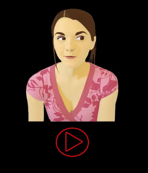
otherwise it'll look a bit more dramatic, like this...
oh and just in case anyone prefers the OLD one...let me know NOW..i'm submitting in like a day or so:
 |
|
| Back to top |
|
 |
GoodGollyItsHolly
P. Monkey's Agent

Joined: 19 Oct 2006
Posts: 2079
Location: Pacey Whitters Arms
|
| Posted: Fri Nov 17, 2006 1:56 am Post subject: |
|
|
i like the new one without the logo... except for the clevage, thats kinda weird.. other than that it looks really good really sharp. you must have worked your butt off!
_________________
Im sorry; you must have mistaken me for someone else. My name is Anastasia Beaverhousen.
Jonas Is OBSESSED!!
http://one.revver.com/watch/297382/flv/affiliate/48242 |
|
| Back to top |
|
|
curriguy
Enthusiastic Fan
Joined: 14 Sep 2006
Posts: 397
|
| Posted: Fri Nov 17, 2006 2:10 am Post subject: |
|
|
| GoodGollyItsHolly wrote: | | i like the new one without the logo... except for the clevage, thats kinda weird.. other than that it looks really good really sharp. you must have worked your butt off! |
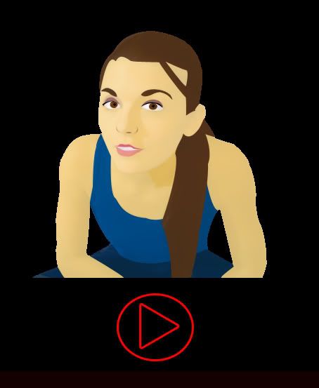
haha! you have a GOOD point...there really shouldn't be cleavage...
I've been drawing realistically lately sooo...I guess it slipped...
 oops! oops!
it's easily removable though..
and thanks, it def. took some work! I'll mark that as one vote for No-Logo.
P.S.
here's what it'd look like minus the cleavage:
 |
|
| Back to top |
|
|
GoodGollyItsHolly
P. Monkey's Agent
Joined: 19 Oct 2006
Posts: 2079
Location: Pacey Whitters Arms
|
| Posted: Fri Nov 17, 2006 2:15 am Post subject: |
|
|
Much better!
the whole thing looks great, and now that the boobies are done it looks perfect!
how do you do that?
_________________
Im sorry; you must have mistaken me for someone else. My name is Anastasia Beaverhousen.
Jonas Is OBSESSED!!
http://one.revver.com/watch/297382/flv/affiliate/48242 |
|
| Back to top |
|
|
Kasdeja
Hymn of One
Joined: 15 Sep 2006
Posts: 7754
Location: Back...and to the left.
|
| Posted: Fri Nov 17, 2006 7:55 am Post subject: |
|
|
| awesome, curriguy! |
|
| Back to top |
|
|
PushedButton
Devoted Fan

Joined: 15 Sep 2006
Posts: 513
Location: En-ger-land, Guvna.
|
| Posted: Fri Nov 17, 2006 12:37 pm Post subject: |
|
|
| Kasdeja wrote: | | awesome, curriguy! |
Agreed.
_________________
Yes, I do play croquet with the queen actually. We all do here.
http://www.youtube.com/watch?v=2EGW2tvTPXg |
|
| Back to top |
|
|
AutoPilate
The Order of Denderah

Joined: 18 Oct 2006
Posts: 4344
Location: Vatican City State (Holy See)
|
| Posted: Fri Nov 17, 2006 12:58 pm Post subject: |
|
|
Well done, mate. :thumbsup:
_________________
Why was there BACON IN THE SOAP?! |
|
| Back to top |
|
|
GoodGollyItsHolly
P. Monkey's Agent
Joined: 19 Oct 2006
Posts: 2079
Location: Pacey Whitters Arms
|
| Posted: Fri Nov 17, 2006 3:55 pm Post subject: |
|
|
I still really really really really like it. just so you know 
_________________
Im sorry; you must have mistaken me for someone else. My name is Anastasia Beaverhousen.
Jonas Is OBSESSED!!
http://one.revver.com/watch/297382/flv/affiliate/48242 |
|
| Back to top |
|
|
livelongandprosper77
Devoted Fan

Joined: 01 Nov 2006
Posts: 546
Location: Tennessee
|
| Posted: Fri Nov 17, 2006 6:06 pm Post subject: |
|
|
Genius man pure genius! 
_________________
LLP is in the house fo rizzle.
Lonelygirl15: "Time for another episode of p-r-o-v-i-n-g s-c-i-e-n-c-e wronngggg!"
Capt. Picard: "Tea Earl Grey, hot" |
|
| Back to top |
|
|
curriguy
Enthusiastic Fan
Joined: 14 Sep 2006
Posts: 397
|
| Posted: Sat Nov 18, 2006 2:36 am Post subject: |
|
|
thanks everyone!
edit: I'm gonna try to make a danielbeast one...
we'll see if I get the time |
|
| Back to top |
|
|
iamcool
The Order of Denderah

Joined: 01 Oct 2006
Posts: 5981
Location: England
|
| Posted: Sat Nov 18, 2006 6:40 am Post subject: |
|
|
 they are awesome!!!! they are awesome!!!!
_________________
my name is josh, not iamcool or iam or cool
cooltron5000 is also accepted
My lawyers told me to edit the content of this signature so i didn't get sued
Me and Oobles are 'TWAT's - 'The Worldwide Association of Threadjacking' |
|
| Back to top |
|
|
Reb
Casual Observer

Joined: 21 Oct 2006
Posts: 96
Location: London/Brighton uk
|
| Posted: Sat Nov 18, 2006 11:48 am Post subject: |
|
|
Really good much better than mine,
I would advice you keep the cleavage in, not because I have a dirty mind just because it makes it look more realistic in my oppinion.
_________________
The only man who's worth your tears will never make you cry |
|
| Back to top |
|
|
canadas_baby
Casual Observer

Joined: 25 Oct 2006
Posts: 122
Location: Nova Scotia, Canada
|
| Posted: Sat Nov 18, 2006 5:34 pm Post subject: |
|
|
| Reb wrote: | Really good much better than mine,
I would advice you keep the cleavage in, not because I have a dirty mind just because it makes it look more realistic in my oppinion. |
I agree ..
_________________
Whatever happened to that girl Tachy?
Oh dear. |
|
| Back to top |
|
|
curriguy
Enthusiastic Fan
Joined: 14 Sep 2006
Posts: 397
|
| Posted: Mon Nov 20, 2006 5:33 pm Post subject: |
|
|
| Reb wrote: | Really good much better than mine,
I would advice you keep the cleavage in, not because I have a dirty mind just because it makes it look more realistic in my oppinion. |
It definately adds realism but
I want the shirt to appeal to as broad of an audience as possible.
I figure it's better to err on the side of safety...rather than potentially offend/discourage potential buyers?
Also, a little bit of realism can easily be sacrificed given that this is a cartoon |
|
| Back to top |
|
|
lonelyfan13
Lonely Fan

Joined: 11 Nov 2006
Posts: 154
|
| Posted: Mon Nov 20, 2006 10:03 pm Post subject: |
|
|
I still think she could be looking more happy in the pic, and I think the color of the arrow would look better if it matched her shirt, or maybe if it was just plain white. and I say, no logo.
_________________
I'm canon! |
|
| Back to top |
|
|
|

